SAGE Analytics
SAGE Analytics providing a possibility to present positioning data using graphical metrics.
- This tool is designed mainly for demonstration purposes, processing is limited to several hundred thousands positions so it can be used for analysis in range of days not months or even years.
- Sage Analytics is not suited for deployments with multiple Plans.
Sage Workflow
This picture shows how simple it is convert data to a graph using analytics dashboard tool. Only three steps are required.
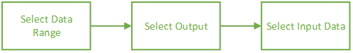
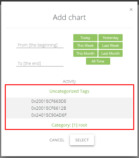
Hit the red plus button in the bottom right corner to add chart, then:
select a data range from date to date, to analyze,
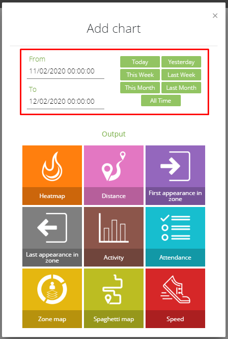
select a metric how data will be presented,
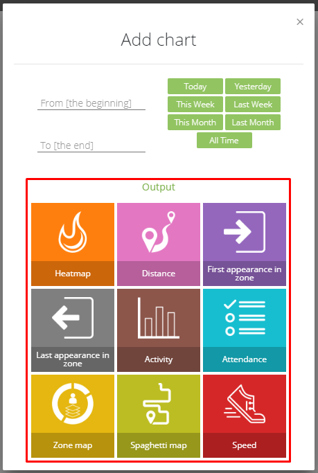
select from which tag or tags the data will be analyzed.
SAGE Analytics Metrics

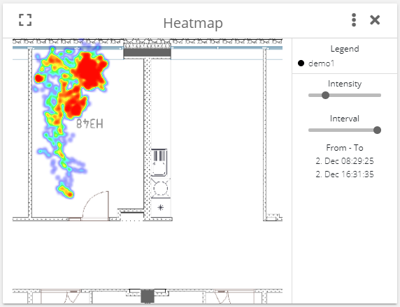
Heatmap is graphical map representation of density of dots (localization points) on a map. If there are more points on one spot or very close to it, then color of that location will be amplified.
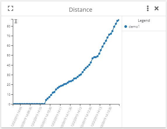
Distance graph shows how many meters the tag(s) made from the selected date range. This metric is a cumulative value. The maximum number of intervals per graph is 60. Each interval is the length of the graph (selected date interval) divided by 60. For each interval, the distance between positions is calculated and it is added to the previous value, under two following conditions:
- minimum distance is reached (0.3 m),
- maximum speed is not exceeded (20 m/s).
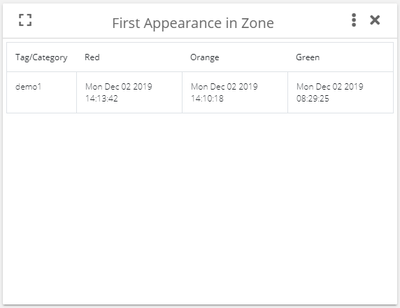
First appearance in zone shows a table which contains information when the selected tag or tags appear in the selected zone or zones for the first time.
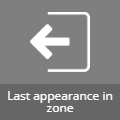
Last appearance in zone shows a table which contains information when the selected tag or tags appear in the selected zone or zones for the last time.


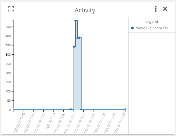
Activity graph shows how many positions were calculated for the selected tag or tags. This metric divides the selected interval into minutes and for each minute the number of computed positions is calculated. The graph shows the timestamp of the first position in this minute interval. Thanks to this metric, we can see tag's activity in time. This metric also works with the zones so it is possible to show activity in a specific zone.

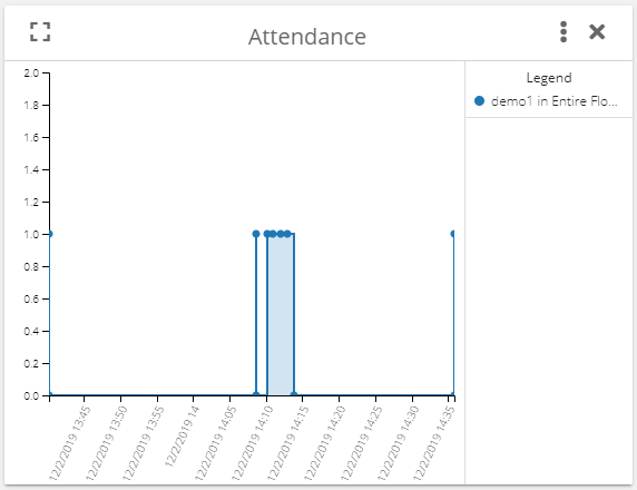
Attendance graph shows attendance in the zone. For the selected zone it shows if the selected tag or tags are present or not. This metric divides the selected interval into minutes similarly to the activity graph above. For each minute of this interval, the graph shows if the tag or tags are present or not. The graph shows the timestamp of the first activity in this minute interval.
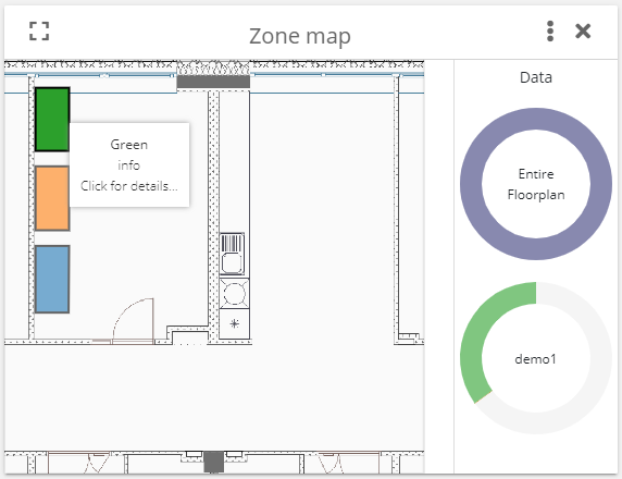
Zone map is an interactive map showing zones. After clicking on the zone the, a pie graph will show long a tag spent time in the selected zone. After clicking on the pie chart, another pie chart appears and shows how long concrete tag spent in the selected zones within the selected interval.

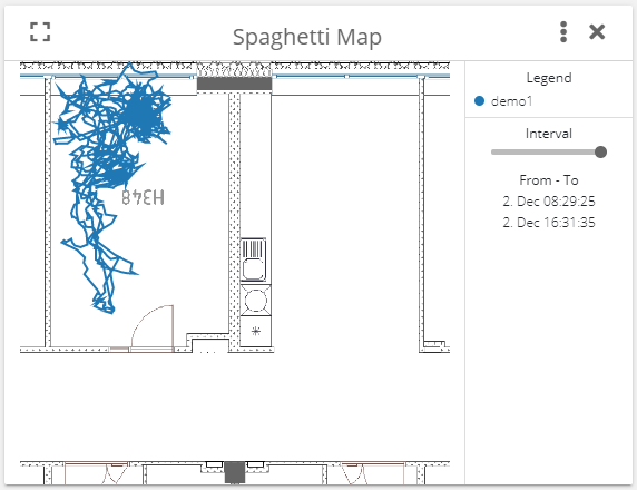
Spaghetti map shows a path of the tag(s) for the selected time range.

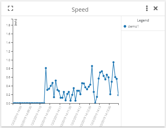
Speed graphs divide the selected time to equally long intervals. The number of intervals is always around 60. Average speed of the selected tag is calculated for each interval and this value is visualized in the graph. The graph shows average speed of each interval.
Categories
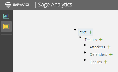
This feature allows to assign tags to some category or even sub category and visualize result for it. Let's provide a simple example. Let's have an ice hockey game where we want to make a category for team A and its subcategories for attackers, defenders and goalies.
SAGE API
API is described within our interactive demo: https://demo.sewio.net/documentation/api-sage